VINTAGE VIDEO GAME POSTER SERIES
A personal poster series inspired by vintage horror and sci-fi movie advertising. Combining iconic video game titles with the visual language of classic cinema posters, these designs explore nostalgia, typography, texture, and cinematic storytelling through digital art created entirely in Photoshop.


Concept
The goal of this project was to merge two major creative influences in my life: classic vintage movie posters and modern video games. I wanted to recreate the feeling of old theatrical advertising by reimagining recognizable game titles through retro-inspired layouts, dramatic typography, grain textures, and cinematic composition.
Inspiration
A large part of the inspiration came from vintage horror, sci-fi, and action movie posters from the 1960s–1990s. I explored references through Pinterest, classic film advertising, and retro poster archives to study composition, color palettes, texture, and typography.
Creative Direction
Each design was approached like a real theatrical release poster. I focused on building atmosphere through lighting, distressed textures, bold title treatments, and dramatic framing while still preserving the identity of the original games.
Research & Visual Analysis
Rather than starting with moodboards, I began by studying individual movie posters that stood out because of their composition, typography, color palettes, and visual hierarchy. I analyzed how each poster communicated its genre and tone through design choices before selecting a video game that shared similar themes or atmosphere.
The pairing process became a key part of the project. Instead of choosing games and posters randomly, I looked for connections between the original film and the game world. Horror posters were paired with horror games, Western films with Western-inspired games, and psychological thrillers with games that shared similar emotional and visual qualities.
Visual Style Analysis
Examined typography, composition, texture, and genre conventions.

Theme Matching
Selected games that shared similar themes, tone, and atmosphere.
Poster Adaptation
Rebuilt the design using game imagery while preserving the recognizable structure of the original poster.
Process & Exploration
Once a source poster was selected, I analyzed its composition, hierarchy, typography, color treatment, and overall visual structure. The goal was not to create an exact replica, but to reinterpret the design through the lens of a different game franchise while preserving the spirit of the original artwork.
01. Research
Study original movie posters and identify key visual elements.
02. Concept Selection
Match a game franchise with a poster style that shares similar themes.
03. Design Development
Rebuild composition using game assets, typography, and effects.
04. Refinement
Apply textures, grain, and color grading for final polish.
Design Breakdown
Each poster was created through a direct visual reconstruction process inside Photoshop. Rather than planning layouts in advance, I worked iteratively by analyzing the original poster and continuously adjusting my design until the composition, typography, and overall mood closely matched the reference.
Reference Analysis
I began by closely studying each original poster, focusing on visual hierarchy, spacing, typography style, contrast, and composition. This helped establish what needed to be recreated in my version.
Visual Matching in Photoshop
Instead of sketching layouts, I worked directly in Photoshop, searching for or editing images that matched the pose, lighting, and framing of the original design as closely as possible.
Iterative Reconstruction
The composition was built layer by layer, constantly compared against the original poster and adjusted until the hierarchy and structure felt accurate.
Final Refinement
Colour grading, texture overlays, grain, and contrast adjustments were applied to match the aged cinematic feel of the source material.
Poster Comparisons
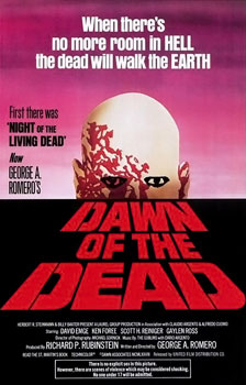
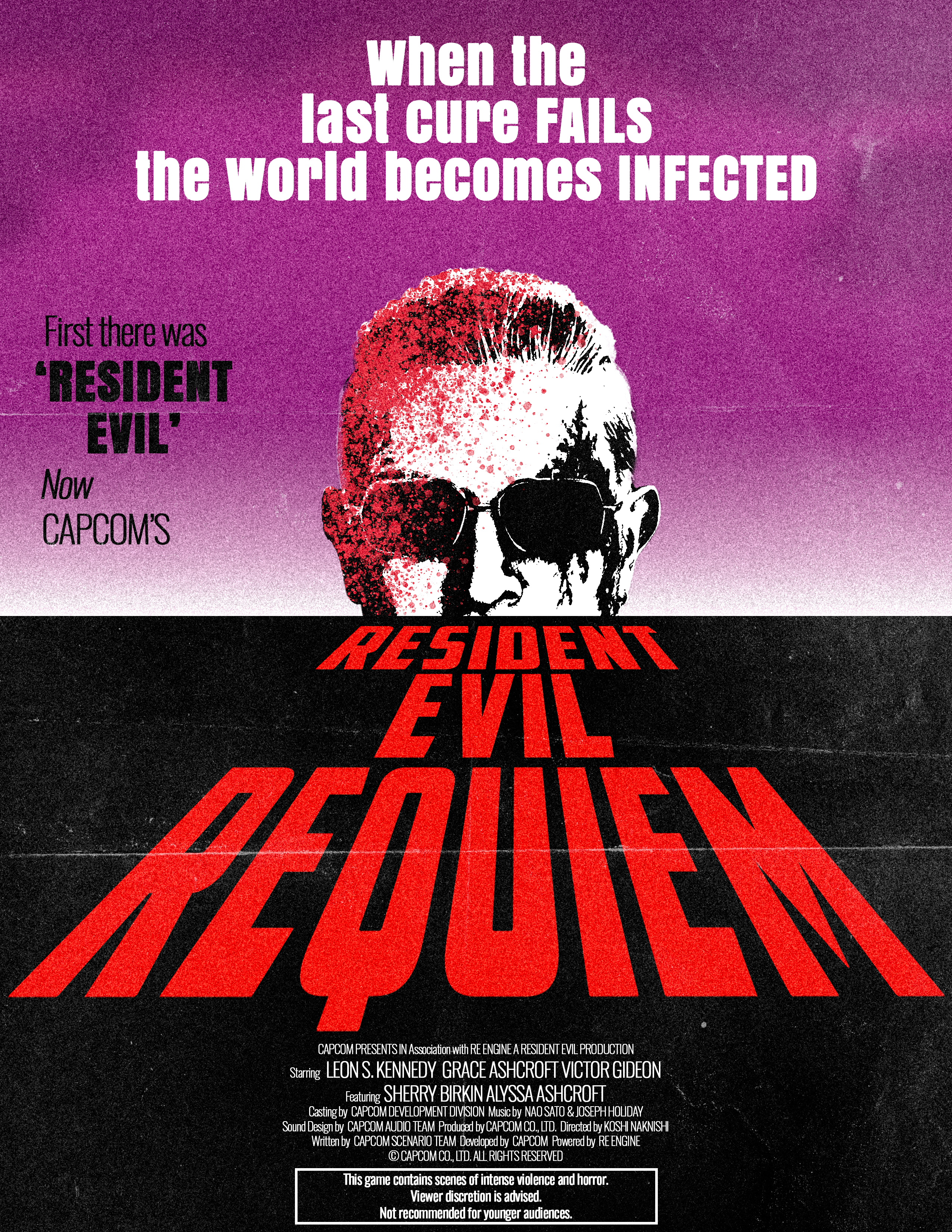
Dawn of the Dead × Resident Evil
Inspired by the classic horror poster for Dawn of the Dead, this redesign blends vintage horror aesthetics with the atmosphere of Resident Evil. I focused on recreating the dramatic composition, distressed textures, and theatrical typography style commonly found in retro zombie film advertising.
Original Poster
 My Reimagined Version
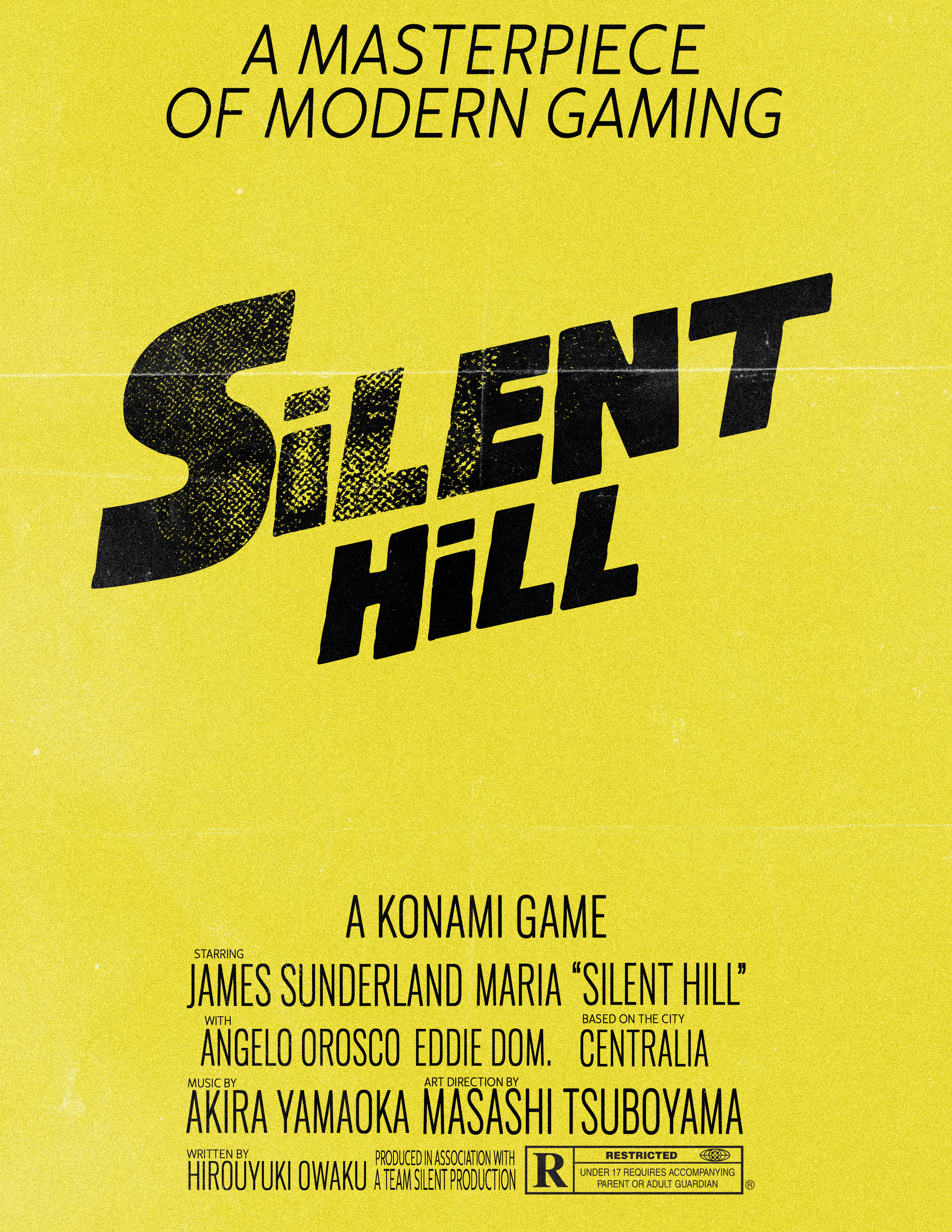
The Shining × Silent Hill
This design takes inspiration from the unsettling minimalism and psychological tension of The Shining poster and combines it with the eerie atmosphere of Silent Hill. Fog, muted tones, and layered textures were used to create a sense of unease while preserving the cinematic style of vintage horror advertising.
Original Poster
 My Reimagined Version
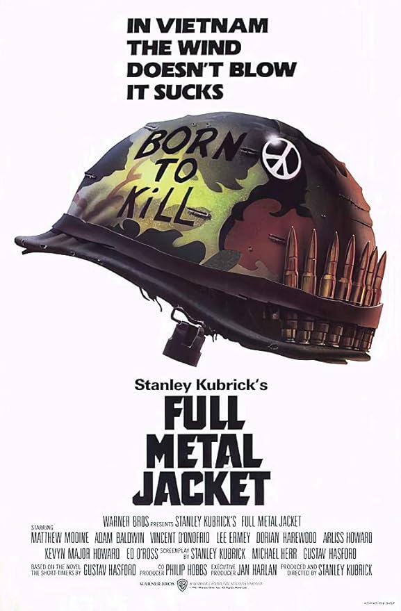
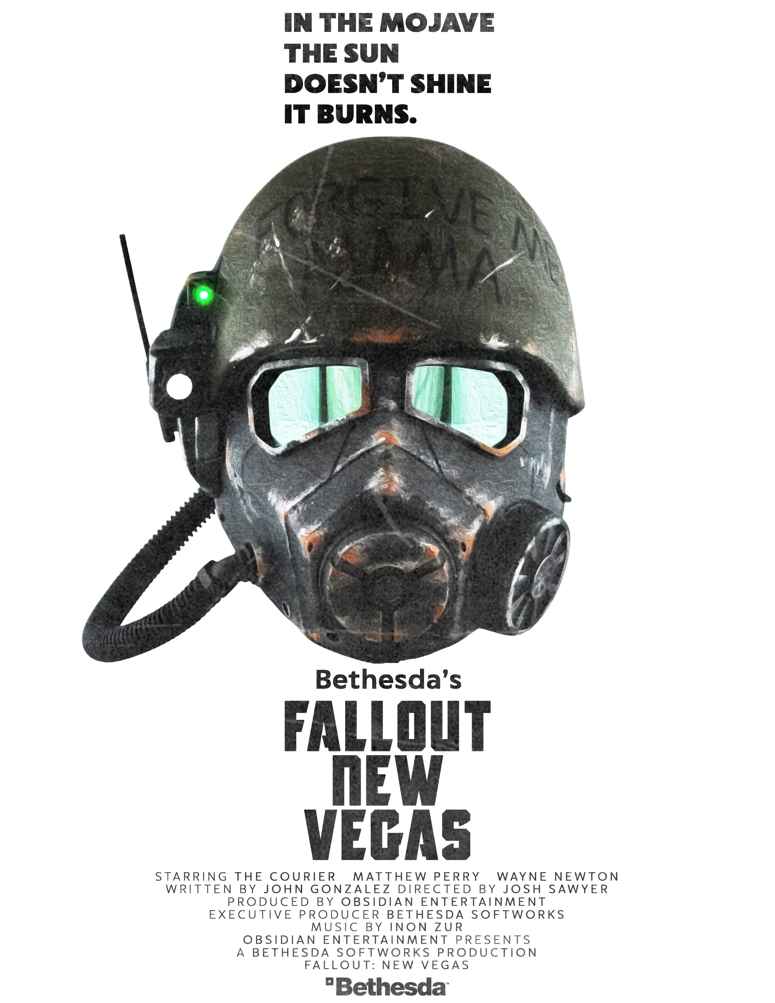
Full Metal Jacket × Fallout
Inspired by the iconic Full Metal Jacket poster, this redesign reimagines the visual style through the world of Fallout. I explored bold typography, military-inspired color palettes, and aged print textures to recreate the gritty cinematic feeling of classic war film posters.
Original Poster
 My Reimagined Version
Harakiri × Ghost of Tsushima
This poster was inspired by the composition and dramatic framing of the Harakiri film poster. I adapted the aesthetic to fit Ghost of Tsushima while maintaining the minimalist structure, cinematic contrast, and traditional samurai film influence present in the original design.
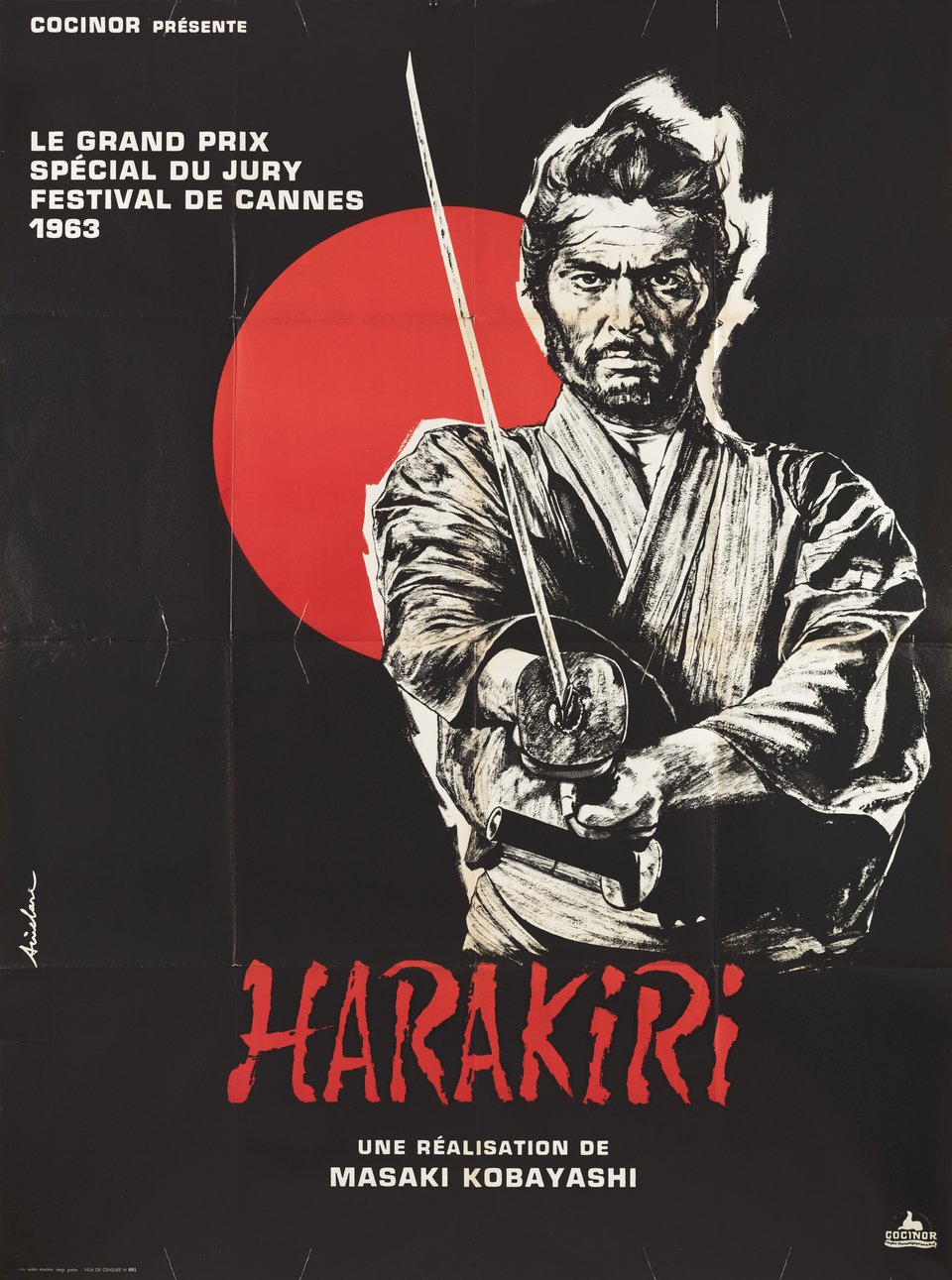 Original Poster
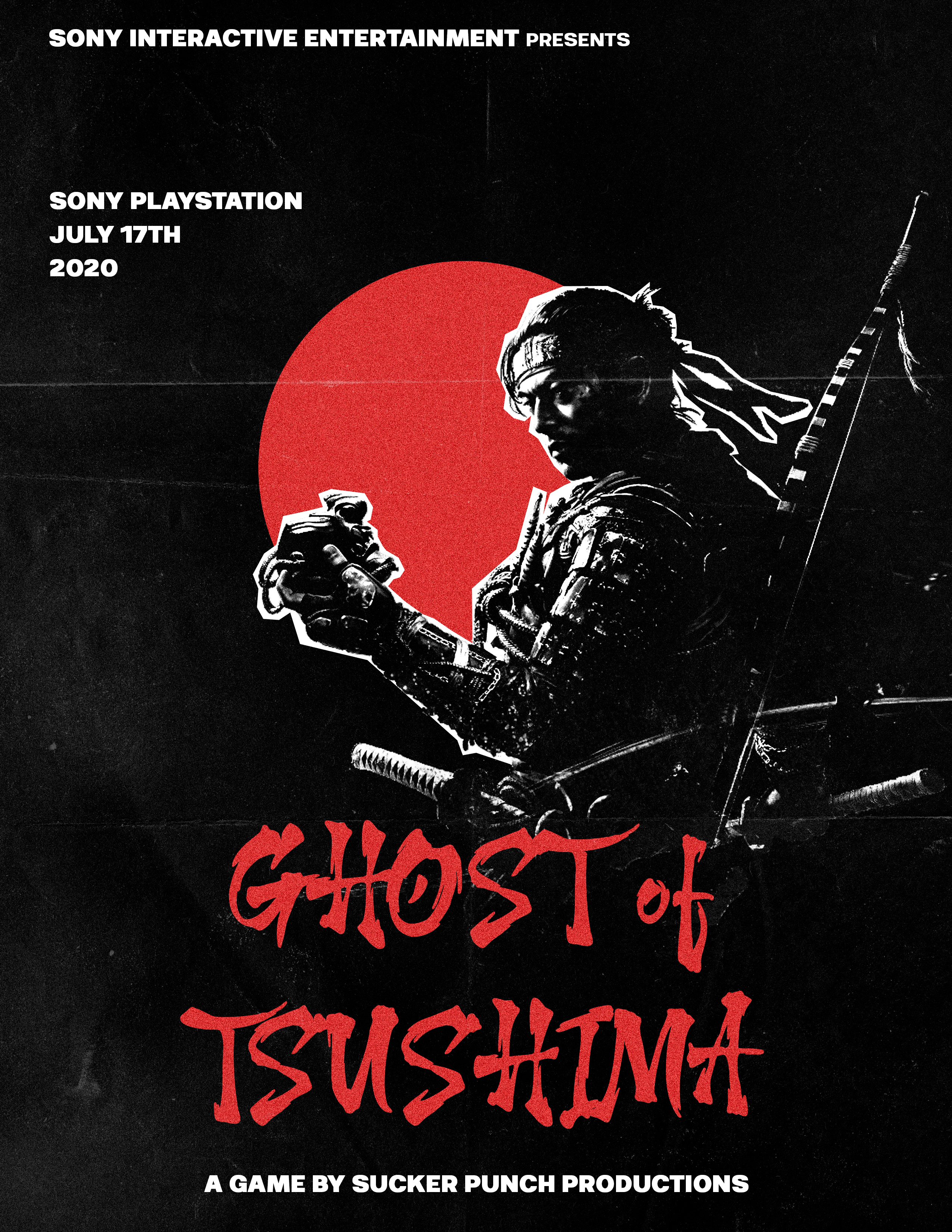 My Reimagined Version
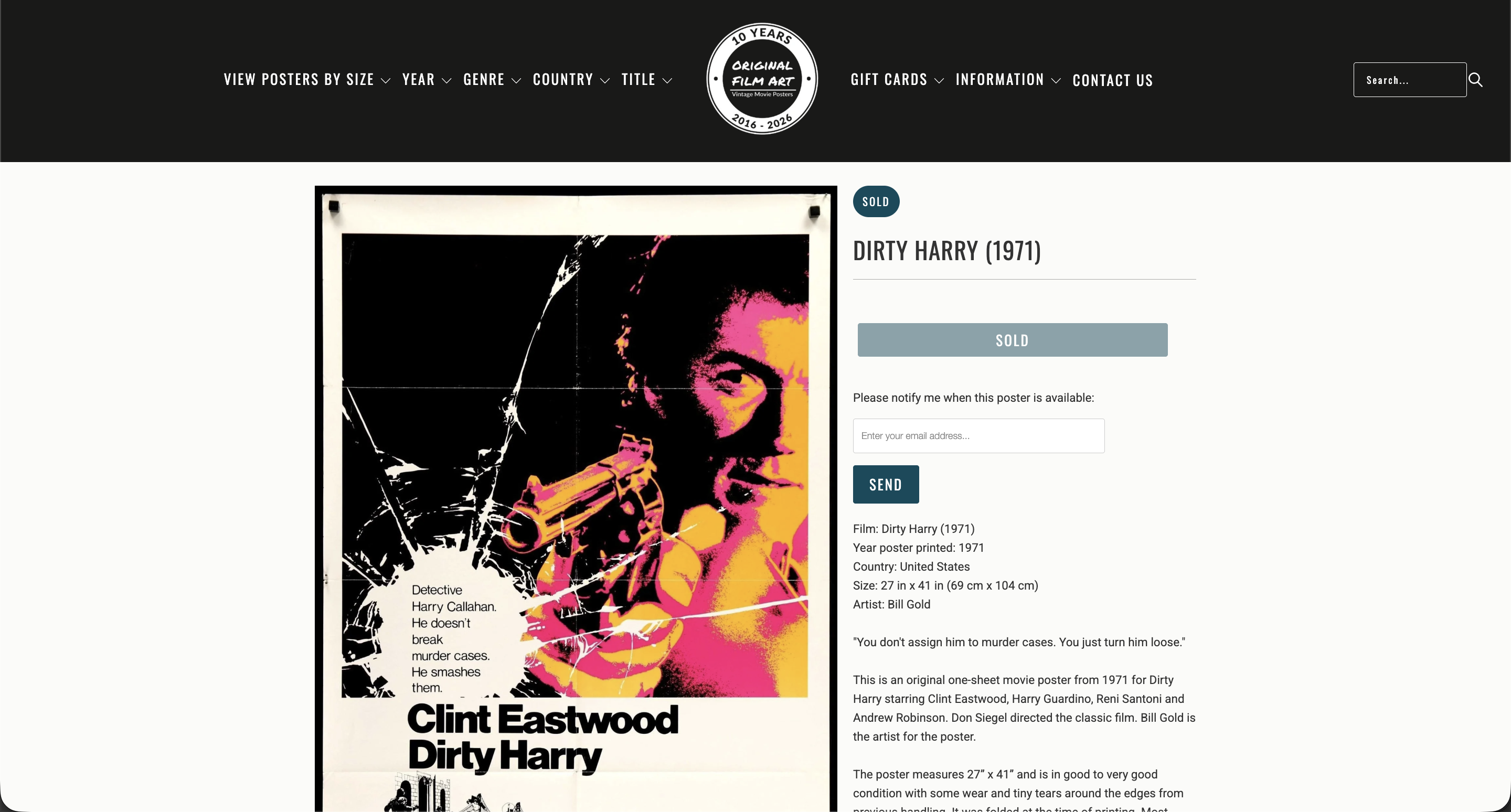
Dirty Harry × Red Dead Redemption 2
Inspired by the iconic Dirty Harry poster, this redesign reimagines its gritty, hard-edged visual style through the world of Red Dead Redemption 2, I explored rugged typography, Western-inspired color palettes, and worn, weathered textures to capture the tension and moral ambiguity of classic crime cinema blended with the cinematic frontier atmosphere of the Wild West.
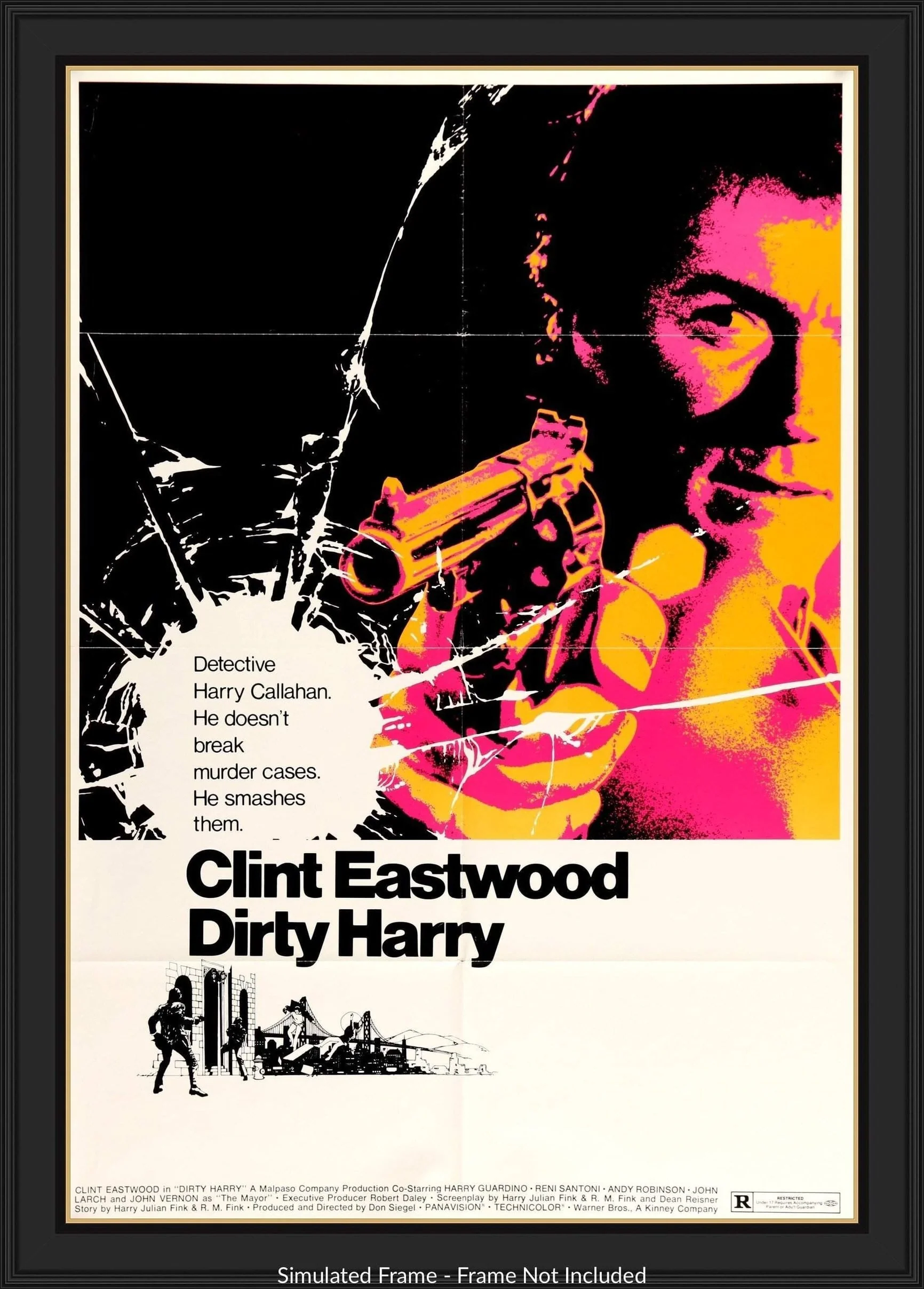 Original Poster
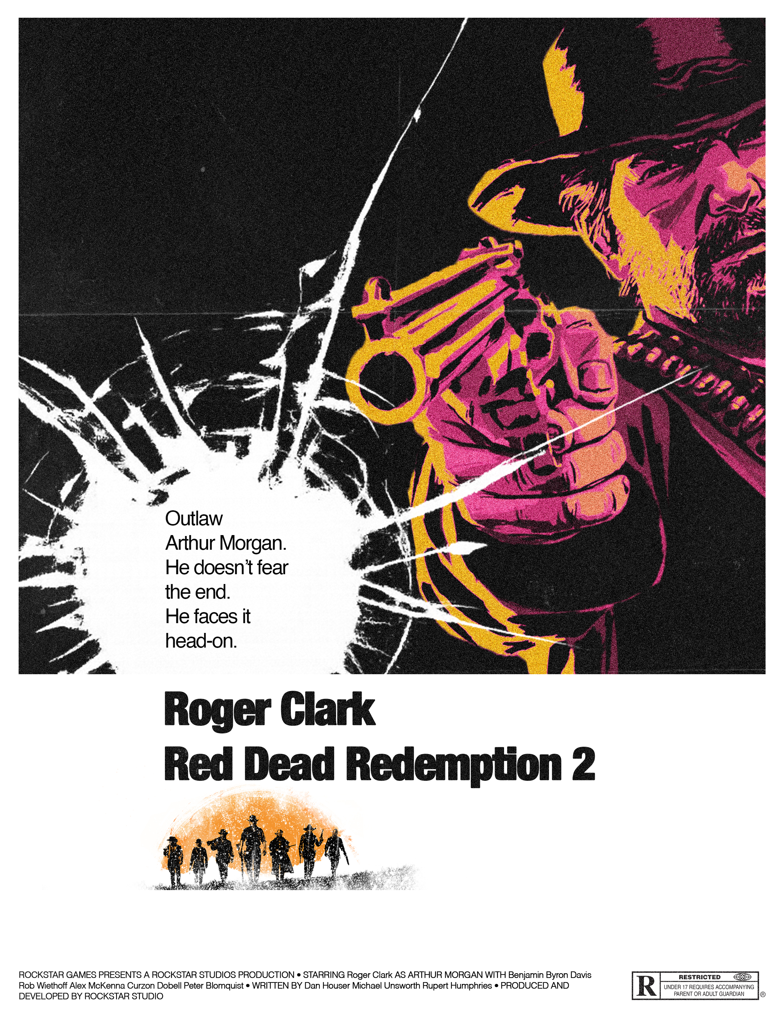 My Reimagined Version
Key Design Decisions
Typography
Vintage-inspired typefaces were selected to reflect the era and genre of each original movie poster while maintaining readability and visual impact.
Texture & Aging
Film grain, paper textures, scratches, and distressed overlays were used to recreate the appearance of aged theatrical prints.
Color Grading
Each poster uses a carefully selected palette inspired by the source material to reinforce mood and atmosphere.
Composition
Original layouts were studied and adapted to preserve the visual identity of the source posters while introducing new characters, settings, and narratives.